
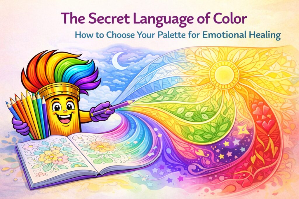
Have you ever opened a fresh coloring page, stared at the intricate lines, and felt a sudden wave of indecision? You have a 72-pack of pencils in front of you, but suddenly, choosing between “Sky Blue” and “Electric Cobalt” feels like a high-stakes life decision.
Believe it or not, that instinctual pull toward certain colors isn’t random. It’s your brain’s way of telling you what it needs. This is the core of Color Psychology—the study of how different hues affect our moods, our heart rates, and even our hormone levels. When we color for healing, we aren’t just making a pretty picture; we are selecting a “prescription” of light and frequency to help balance our internal state.
The Connection Between Mood and Hue
For centuries, artists and healers have known that color has the power to change our perspective. In the modern world, we are constantly bombarded by “commercial” color psychology—think of the aggressive reds and yellows used in fast-food logos to trigger hunger, or the sterile blues in tech company branding to suggest “trust.”
When you sit down to color, you are taking the wheel. You get to decide if your environment needs to be cooled down or warmed up. By understanding the “language” of color, you can turn a simple coloring session into a targeted session for emotional relief.
1. The Blue Zone: Silence the Noise
If you are coming home after a chaotic day at work or dealing with high-functioning anxiety, Blue is your best friend.
Blue is globally recognized as the most “calming” color. Physiologically, exposure to blue has been shown to lower heart rates and even slow down breathing. It represents the sky and the sea—two of the most vast, peaceful elements in nature.
- When to use it: Use shades of blue when you feel “hot” with anger, overwhelmed by a long to-do list, or when you’re coloring right before bed to combat insomnia.
- The Healing Effect: It creates a sense of space and distance from your problems.
2. The Yellow & Orange Spark: Fighting the Fog
On the opposite end of the spectrum, we have the “Warm” colors. If you’ve been feeling sluggish, unmotivated, or a bit “gray” (common during the Maine mud season or long winters), reaching for Yellow and Orange can act as a mental stimulant.
Yellow is the color of the sun and is closely linked to dopamine production. It’s a “happy” color, but it needs to be used with intent. Too much bright yellow can sometimes trigger a bit of edge, so blending it with soft oranges or creams creates a “golden hour” effect that feels cozy and optimistic.
- When to use it: When you feel a bit depressed, low-energy, or stuck in a creative rut.
- The Healing Effect: It mimics the feeling of a warm sunbeam, sparking “micro-moments” of joy.
Flow Says…
“Don’t let the ‘rules’ of the real world stop you. If you’re feeling blue but the picture is of a sun, go ahead and make that sun blue! This is your world, and your brain cares more about the color you’re using than whether a tree ‘should’ be green. If a purple tree makes you smile, it’s the right choice.”
3. Green: The Great Grounder
There is a reason we feel better after a walk in the woods. Green is the most balanced color in the spectrum, sitting right in the middle. It represents growth, renewal, and equilibrium.
In color therapy, green is used to create a sense of safety. Because our ancestors associated green with water and food sources, our brains are hardwired to feel “at home” when we see it. If you feel “scattered” or like your thoughts are flying in a million directions, green can help anchor you.
- When to use it: When you feel ungrounded, restless, or like you’ve lost your center.
- The Healing Effect: It provides a sense of “stability” and reminds the nervous system that you are safe.
4. Purple: The Creative Bridge
Purple is a unique beast. It’s a mix of the stability of blue and the energy of red. This makes it the color of Intuition and Mystery. Historically associated with royalty and spirituality, purple is the perfect choice for when you want to get “in the zone.” It encourages deep thinking and problem solving. If you’re coloring while trying to work through a complex life problem, incorporating shades of violet and lavender can help open up the “creative” side of your brain.
- When to use it: During “Flow State” sessions where you want to lose yourself in the details.
- The Healing Effect: It encourages a “higher perspective,” helping you see the big picture rather than sweating the small stuff.
5. Red: Use with Caution
Red is the color of passion, energy, and survival. It increases your pulse and gets the blood moving. While it’s great for adding a “pop” to a page, use it sparingly if you are already feeling anxious.
However, if you are feeling powerless or invisible, a bold splash of red can be incredibly empowering. It’s a “loud” color that says, “I am here.”
- When to use it: When you need a boost of confidence or a physical energy lift.
- The Healing Effect: It triggers a “proactive” mindset, moving you from a passive state into an active one.
6. Relieving “Decision Fatigue” with a Limited Palette
Sometimes, the sheer number of choices is what stresses us out. This is called “Decision Fatigue.” To combat this, try a Limited Palette challenge.
Choose only three colors before you start. This restriction actually frees your brain because you no longer have to wonder “what’s next?” You’ve already set the boundaries. This is a powerful way to practice “Controlled Creativity,” which is a major component of art therapy.
Conclusion: Trust Your Instincts
At the end of the day, your eyes will tell you what they want. If you find yourself constantly reaching for the same three pencils, don’t fight it. Your subconscious is trying to tell you something about your current emotional needs.
Adult coloring is a dialogue between your hand and your heart. By understanding the secret language of color, you turn your coloring book into a toolkit for emotional maintenance. So, the next time you open your book, take a deep breath, look at your pencils, and ask yourself: “What does my soul need to see today?”